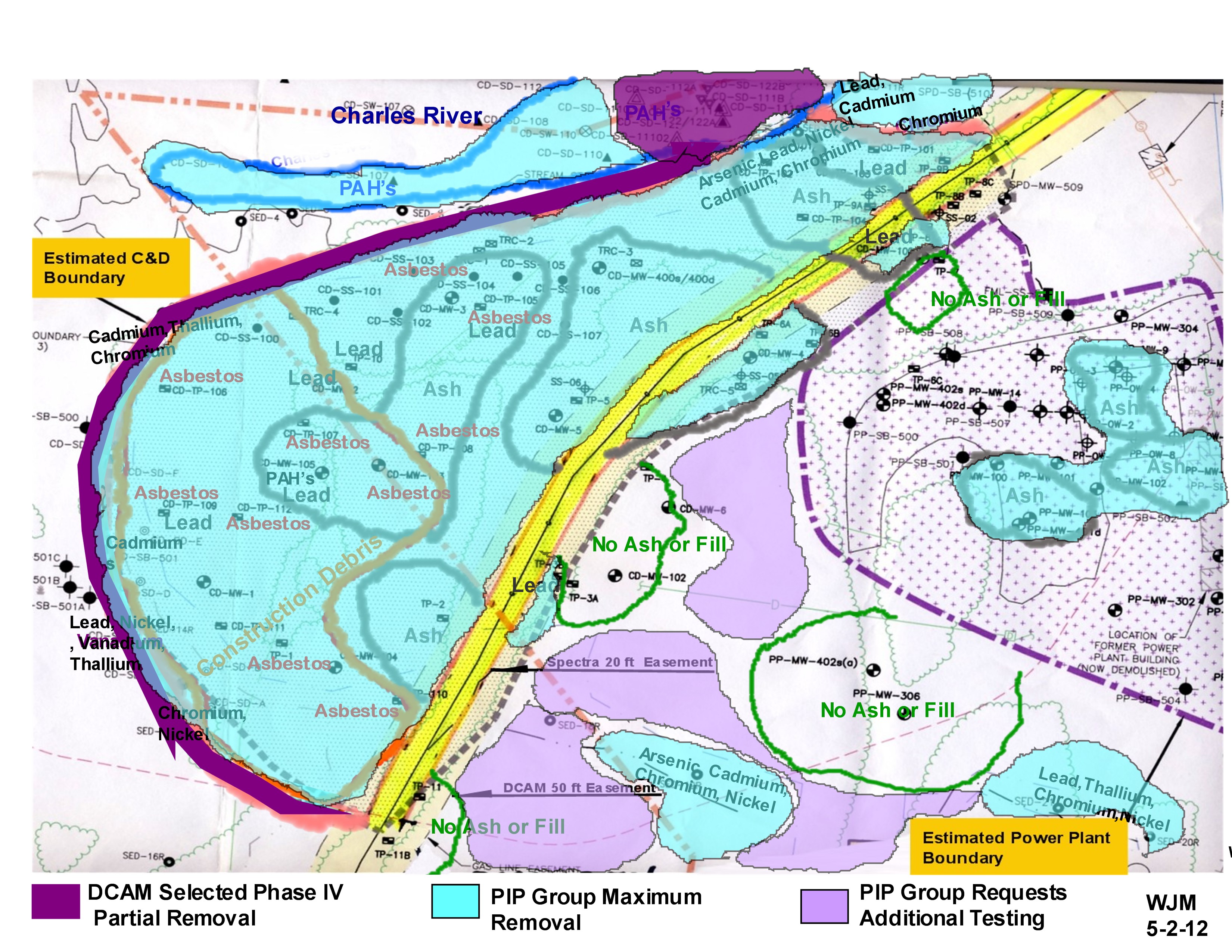
Bill Massaro has prepared a useful chart that graphically shows the dramatic difference between DCAM’s proposed removal of materials from the C&D area, versus what the town requests be removed.
Per Bill’s email –
=====================
Attached is the next stage in the C&D Waste Overlay I passed out last night. That prior one was intended to clarify that the DCAM drawing showing the yellow area around the “donut hole” did not represent what DCAM is planning to take out, but just showed the flexible membrane cover over what they were leaving.
This one shows my conception of what DCAM is removing in dark plum; what I think our residents’ “maximum extent feasible removal” is in blue; and areas where we need additional testing ( likely also to need to be removed) in light purple. I also added some additional contaminants of concern with input from Andrea. It should pretty much agree with Town and PIP Phase II & Phase III comments submitted on 4/24/12.
===================================
See Bill’s chart at –
https://medfield02052.blog/wp-content/uploads/2012/05/20120502-wjm-remediation-positions.jpg
